

Minimalist tattoos may look simple at first glance, but the font choice makes all the difference. The right lettering can feel timeless, personal, and effortlessly stylish. The wrong one can look crowded, dated, or hard to read within a few years. If you’re planning a word, name, date, or short phrase tattoo, choosing the right minimalist font is one of the most important decisions you’ll make.
This guide breaks down exactly how to choose minimalist tattoo fonts that look elegant today and still feel beautiful years from now.
Understand What “Minimalist” Really Means in Tattoo Fonts
Minimalist tattoo fonts focus on clarity, balance, and restraint. That doesn’t mean boring or generic. It means every line has a purpose.
Key traits of elegant minimalist fonts:
- Clean lines with consistent spacing
- No heavy shading or decorative flourishes
- Easy readability at small sizes
- Balanced proportions between letters
Minimalist fonts work best when the design lets the message speak for itself. If you’re drawn to subtle tattoos that feel personal rather than flashy, this style is a perfect match.
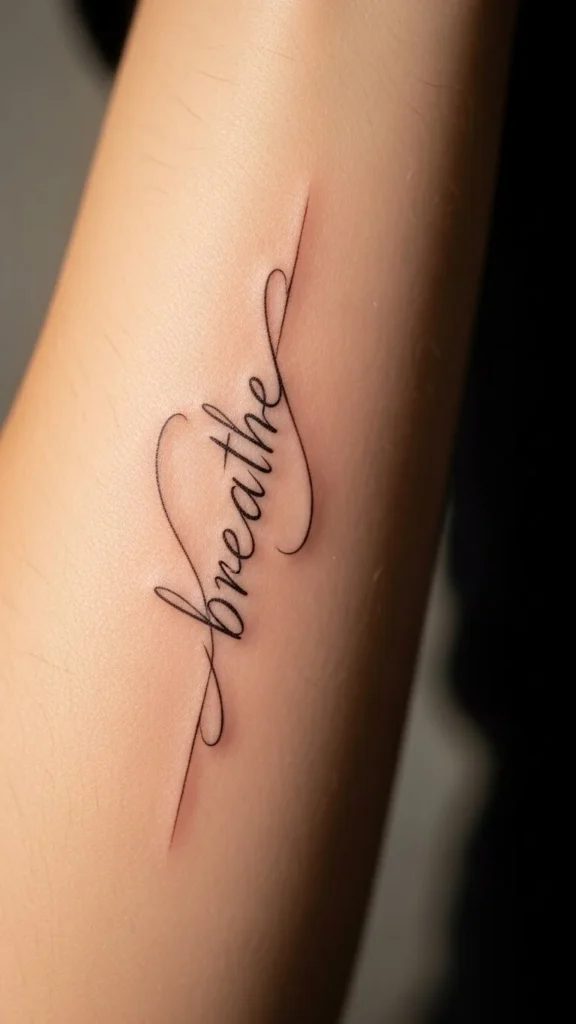
Choose Between Serif and Sans-Serif Carefully
One of the first decisions is whether to go with serif or sans-serif lettering.
Sans-serif fonts
- No extra strokes at the ends of letters
- Feel modern, soft, and understated
- Ideal for single words, names, or coordinates
Serif fonts
- Small finishing strokes on letters
- Feel classic, literary, and refined
- Work beautifully for short quotes or meaningful dates
For true minimalism, thin sans-serif fonts are often the safest choice. However, a light serif font can add just enough personality without overwhelming the design.
Pay Attention to Stroke Weight and Line Thickness
Line thickness matters more than most people realize. Fonts that look perfect on a screen can age poorly on skin if they’re too thin or uneven.
Keep these tips in mind:
- Ultra-thin lines may blur over time
- Slightly thicker strokes age better
- Consistent line weight creates a cleaner look
A good tattoo artist will often adjust a font slightly to make sure it heals well. Trust their experience, especially if you’re going very small.
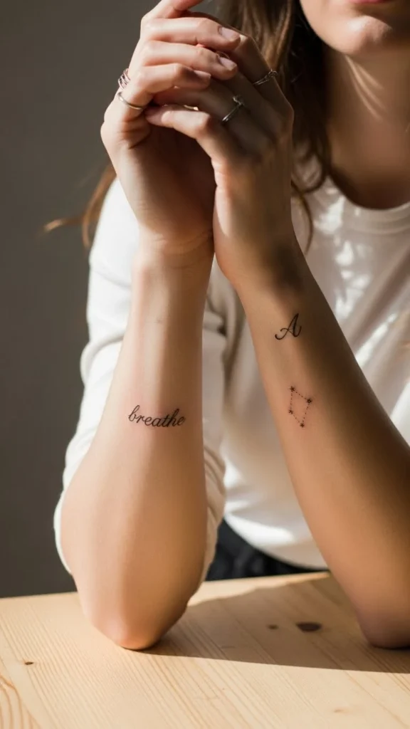
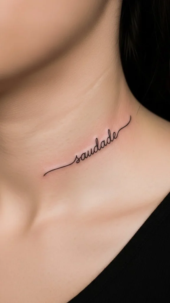
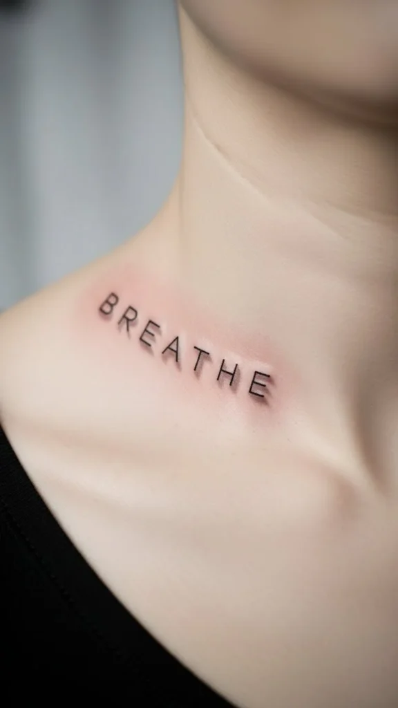
Match the Font to the Placement
Font elegance depends heavily on where the tattoo sits on your body. The same lettering can look completely different depending on placement.
Popular minimalist placements and font tips:
- Wrist or ankle: Simple, narrow fonts with generous spacing
- Ribcage or side torso: Flowing lowercase fonts or light cursive styles
- Collarbone: Clean serif or spaced-out uppercase letters
- Behind the arm or spine: Tall, slender lettering
Always test how the font curves with your body. Straight fonts may need subtle adjustments to follow natural lines.
Keep It Short for Maximum Impact
Minimalist fonts shine when the text is short. Long quotes often lose elegance when squeezed into a small space.
Elegant minimalist tattoo ideas include:
- A single word with deep meaning
- Initials or names
- A meaningful date
- Short phrases of one to three words
Short text allows the font to breathe. It also keeps the design visually calm and easy to read at a glance.
Avoid Overly Trendy Fonts
Trends come and go, but minimalist tattoos are meant to last. Fonts that feel very “of the moment” can quickly look dated.
Be cautious with:
- Overly stylized handwritten fonts
- Fonts with exaggerated loops or angles
- Decorative scripts meant for logos
Instead, look for fonts that feel neutral and timeless. If it resembles classic book typography or clean modern design, you’re usually on the right track.
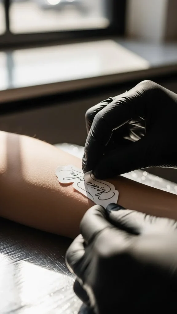
Test the Font Before Committing
Never choose a font without seeing it in real life first. What looks elegant online may not translate the same way on skin.
Try this before your appointment:
- Print the font at actual tattoo size
- Tape it to your skin for a few days
- Take photos in different lighting
- Ask your artist for feedback
This step helps you spot spacing issues, readability problems, or proportions that don’t feel quite right.
Trust Your Tattoo Artist’s Eye
A skilled tattoo artist understands how fonts behave on skin over time. They may suggest small adjustments that protect the elegance of your design.
Good artists will:
- Adjust spacing for clarity
- Thicken lines slightly for longevity
- Recommend better placement for balance
Minimalist tattoos require precision. Collaboration with your artist ensures the final result stays clean and beautiful.
Final Thoughts: Let Simplicity Lead
Choosing a minimalist tattoo font is about restraint, intention, and longevity. Elegant fonts don’t shout. They whisper with confidence.
When in doubt:
- Choose clarity over decoration
- Keep the message short
- Prioritize readability and balance
A well-chosen minimalist font will feel just as meaningful years from now as it does on day one.
Save this guide for later and take your time finding a font that truly reflects you.

Leave a Reply